New Starbucks Logo: A Bad Idea?
January 6, 20112 min
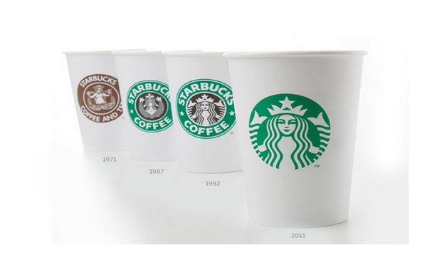
Yes. The new Starbucks logo, which drops the company name is a bad idea.
Yes. The new Starbucks logo, which drops the company name is a bad idea.

Ever wonder what is really behind this thing we call “identity? “
“Make it bigger,” the executive screamed from the corner of the room as I desperately sought a sign-off for an ad featuring a major fashion brand. This wasn’t the first time such a situation came up. In fact, every meeting I had always ended up in discussions about the placement and size of the logo – it was as if that one by one inch space, over time, had become the holy grail of branding...
Creative debates come and go. Some, like that of Tropicana’s new packaging and London’s 2012 Olympic logo are sure to have a long shelf-life.